DDOT Rebrand & Bus Design
Turning Detroit city buses into a message about hope.
-
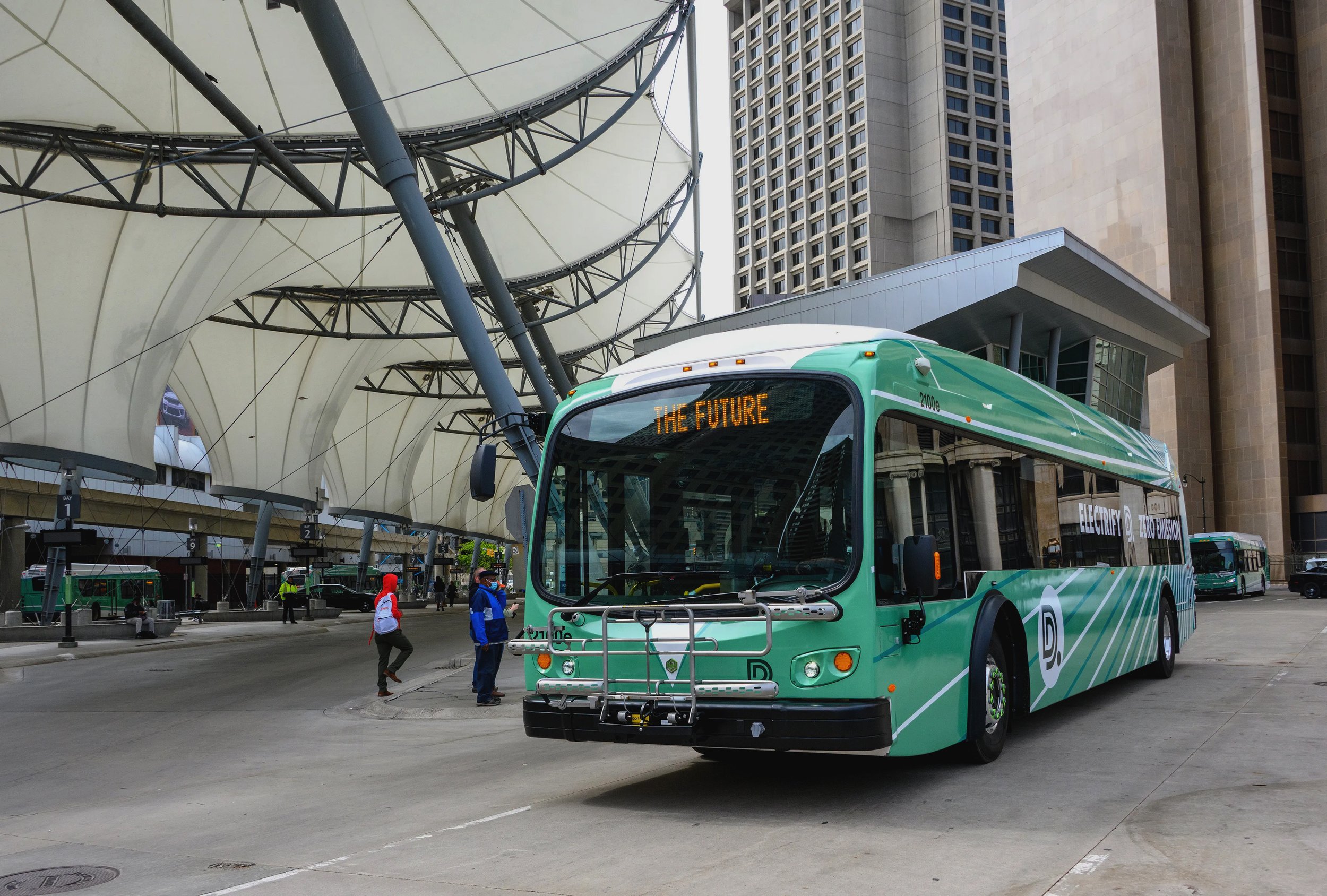
The look of public transportation goes a long way to defining the mood of a city. Our friends in the city asked us to help think through a new logo and identity system for the Detroit Department of Transportation (DDOT). And we got to redesign the buses! For the logo, we worked in collaboration with designer and typographer, Graham Clifford.
Our custom drawn double D conveys positive motion, a connective loop, and better all-round service to the community–with an added dot as a tip of the driver’s cap to the original 1974 mark.
For the buses, the green is based on the Spirit of Detroit statue outside of City Hall, with the radiant lines implying energy, progress, and positive momentum. In the end, it's a message about hope.


